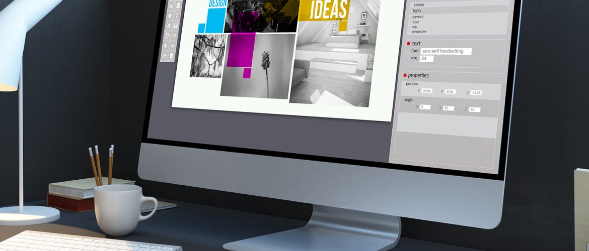
In today’s information age, your website design is as important as the business itself. When developing the website design, you should be aware who your target audience is. Your website layout defines user experience and ultimately, the presence of your brand.
Color Choice in Web Design
When people hear about your brand, the first thing they will do is try searching up your website. Which is why it is very important that you leave a good first impression. The color grid of the page, font, text size and content are all features of website designing. The beverage and food industry will usually choose a bright and contrasting color grid for their website e.g. red or pink while a software company stick with blues and whites. It is better to keep the website theme in line with the brand’s theme. Your font color should also represent your brand’s personality. It does not make sense for a consultancy firm to use neon and abstract colors schemes on their website.
If you are designing a website for the first time, color association studies are amazing sources to learn what kind of colors you should be including in your website. For example, blue represents trust and integrity. If your brand emphasizes on trust, then you should try incorporating more blues. Similarly, if your company sells high quality premium products, then integrating black would represent luxury and exclusivity.
Make Your Layout Relevant
When it comes to layout, try keeping the website as simple, clean and coherent as possible. The number of categories or sections in your website should be determined by the preference of your target audience. Multiple categories and subcategories are easier to understand for age groups below 30; while people in their mid 40s prefer shorter lists and subsections to browse through.
Grids are becoming a popular preference since the past two years. Hence, it is also important to be informed of industry trends and audience reaction to different website layouts.
The text displayed on your website should be easy to read. The color must be solid and text of reasonable size. Younger age groups may prefer funkier fonts while millennial would prefer simple and clean ones.
Make It Accessible and User-friendly
Keeping your target consumer in mind, your website design should still be an accessible layout for all types of audiences. By this, we also mean people with special needs. In some countries, this standard is required by law.
An easy to understand layout will help your audience navigate your website more easily. The ideal concept is that anyone visiting your website should be able to find the information they are looking for as quickly as possible. The more user friendly your website is, more likely it is for potential customers to engage with you.
For example, when people visit our website, it should be easily navigate-able and should have a logical layout; not only for technically sound potential customers, but also for the ones who are looking for a website for their business, in any industry, for the first time.
So in conclusion, don’t take website design lightly. Consider constantly improving and optimizing user experience to increase your website’s traffic.


